Corkboard Rules: What the Village Hall Taught Me About Building a Homepage
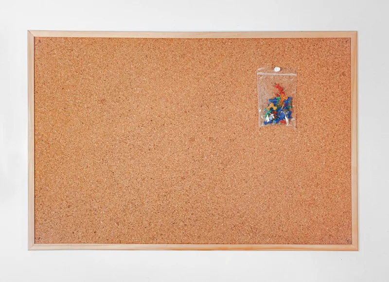
There is a noticeboard in the village hall near me that I have come to regard as a quiet piece of design genius. It is not pretty. The cork is patchy, someone has stapled the same jumble-sale flyer to it three times, and there is a permanent fringe of torn paper along the bottom edge. But it works. People stop, read, find what they need and get on with their day. No cookie banner required.
I have been thinking about it a lot while tinkering with ChrisJM. Personal sites have a habit of becoming performances: polished landing pages, clever animations, a small novel about the creator before you can find their email address. The noticeboard does the opposite. It assumes you are busy, slightly curious and probably wearing a coat. That feels like a better starting point.
The beauty of a pinned layer
A noticeboard is not a single document. It is a stack of things that have accumulated over time, each one pinned on top of the last. The Christmas concert poster sits over the parish council minutes; the piano lessons card is tucked under the yoga timetable; a handwritten note about a missing cat has been given a prime spot near the top because, for one week, it is the most important thing in the village.
That layering is useful. It tells you what is current, what is recurring and what is background. My site has categories and archives, but the homepage often behaves like a brochure. Everything is presented at the same volume. The noticeboard reminds me that a homepage can be a surface, not a statement. New things can go near the top. Older things can stay pinned underneath, still findable, no longer shouting.
I have started treating the top of ChrisJM like that cork surface: a small number of current pins, clearly dated, with older posts left in the archive where they belong. It is not a redesign so much as a change of manners. The page now says: here is what is happening, here is what I have been writing, and here is the door to everything else.
Local relevance beats cleverness
The noticeboard never asks me to sign up for a newsletter. It does not track how long I spend looking at the yoga timetable. It simply puts the information where a person walking past might need it: the hall hire number, the recycling collection change, the date of the next quiz night. Local relevance is the whole point.
For a personal site, local relevance is a bit different. It is not about your postcode; it is about the reason someone has landed there. Most visitors to ChrisJM want one of a few things: to read something, to see what I have made, or to work out how to get in touch. The noticeboard model keeps those things near the surface. It does not hide the contact details beneath a manifesto. It does not make the blog a puzzle. It puts the useful bits at eye level.
I have been pruning accordingly. The projects page now leads with a plain sentence about what each thing is and whether it is finished, ongoing or quietly abandoned. The contact page says how to reach me without a treasure hunt. The homepage has a short line explaining what the site is for. None of it is glamorous. All of it is the equivalent of a clearly written card that says: hall booked, Saturday, seven o'clock, bring a raffle prize.
Handwriting is a feature, not a bug
One of the best things about the noticeboard is that it is obviously made by people. Someone has written a phone number in biro. Someone else has corrected a date with a marker pen. There are wonky edges and mismatched fonts, and that is precisely why it feels trustworthy. It has not been smoothed into anonymity by a template.
Personal websites can learn from that without becoming deliberately scruffy. The goal is not to make ChrisJM look like a school project. The goal is to let the human hand show through where it helps: a plain-spoken about page, a dated note about what I am working on, a small confession when something is half-finished. Handwritten charm is not about literal handwriting. It is about leaving evidence of judgement and personality rather than polishing every thought until it looks like a product.
I have tried to add more of that. The /now page gets updated with actual sentences instead of vague status labels. Project notes say what stage things are at. When I retire a piece of writing, I say so. It is the difference between a noticeboard and a corporate lobby screen: one feels assembled by a neighbour, the other feels assembled to manage you.
Low-tech accessibility is still a design choice
The village hall noticeboard is readable by anyone who can walk through the door. It does not need an app, a login or a fast connection. That is not nostalgia; it is a useful constraint. Personal sites should be similarly easy to enter. Clear type. Sensible contrast. Pages that work on a phone with a patchy signal. No pop-ups asking you to accept a marketing partnership with a biscuit company.
For ChrisJM, that means keeping the site lean. I have been removing scripts that do nothing except count things, cutting back on decorative extras and making sure the text is the main event. The noticeboard does not have a cookie policy because it does not collect anything. My site does not need to be quite that analogue, but it can be much closer to it than it is to a surveillance dashboard.
The great thing about the corkboard as a model is that it is modest. It does not try to be everything. It pins up what the village needs this week, then gets out of the way. A personal website could do worse than aim for the same: clear hierarchy, local relevance, a human hand and information people actually need. If ChrisJM ever starts feeling like a corporate lobby, I will know where to look for the correction. There is a noticeboard down the road, and it has a spare pin.